
*
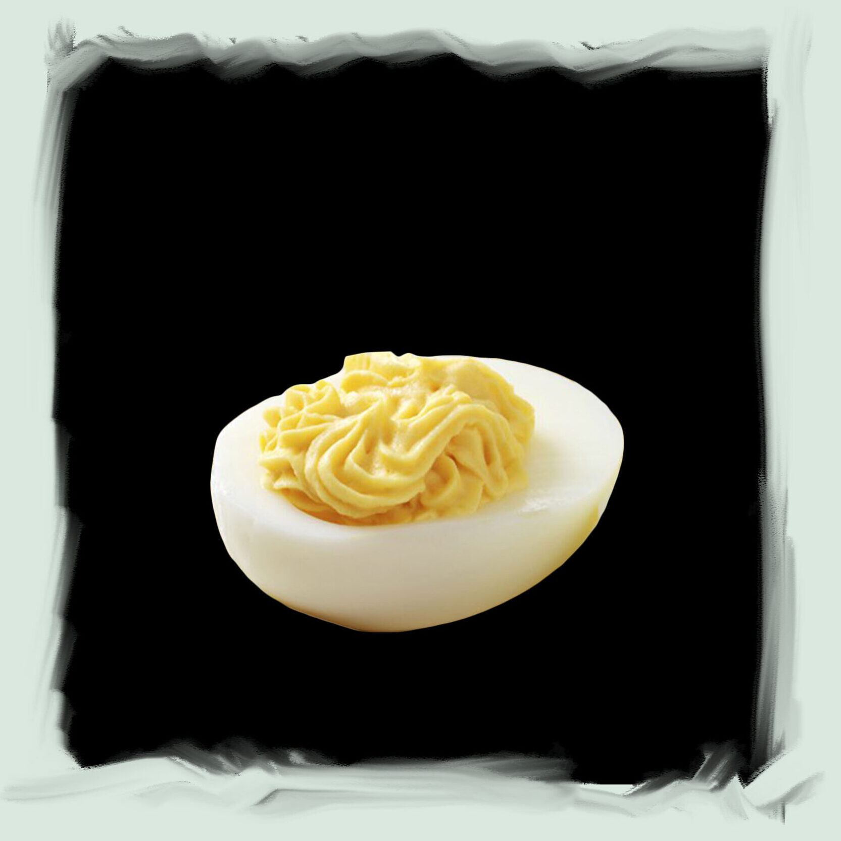
One of my favorite decorated foods is the deviled egg – a frequent dish in my grandmother’s repertoire. What could be more of a meta-decoration? Because how you make this is by mixing the boiled egg yolk with mayonnaise, which is in itself made of eggs, then you put this mix back into the egg white in a decorated manner. This appetizer feels to me like the most literal way of handing me a piece of her time.
*
The first category of decorations are the ephemeral things, the fleeting decorations. The flower arrangements and decorated food.
At the street markets, early autumn is my favorite time in terms of bouquet art. Then you have the wide range of flowers and berries available at the same time. Combos of sticks and berries mixed with weeds and marigolds. Some sellers seem to pick plants they find in
the city, not growing them. Simply observing nature and making arrangements out of the current season.
I see jars of pickles where perfectly layered zucchini and pepper slices make a stripy pattern. Little decorations on the pirogi to signal what is inside – cabbage, carrot or meat? Some of the tables at the physical market are decoration lessons on their own – sellable items together with found objects, plants and flowers placed on a patterned fabric that drips over the table.
*
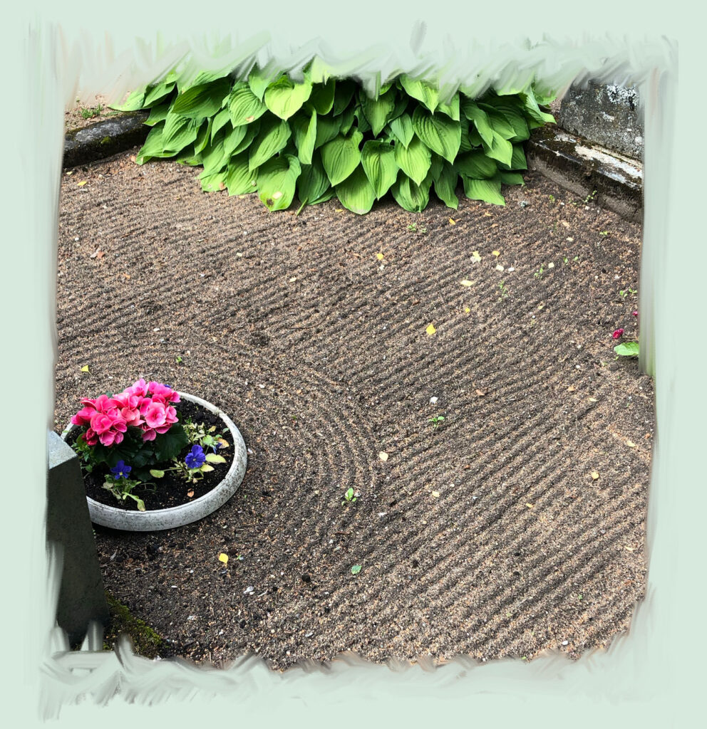
A decorative ritual where my grandmother has always included me, is taking care of family graves. As a kid this was somehow a fun thing to do… as a teenager this seemed like such a waste of time… and now maybe more spiritual dimensions are unfolding. Once the general clean-up is finished, we always draw lines in the sand with a rake. You can never skip this. The graves are not finished unless they are decorated like this.
*
If a deviled egg is like a gift of time, is this an inter-generational gift of time? A meditation that will only last until the next rain. Although there is also a cynic in me that sees the competitive function of this ritual – you can read from the sand patterns, which neighbour is taking better care of their graves, who has the freshly drawn lines and whose lines have faded.

*
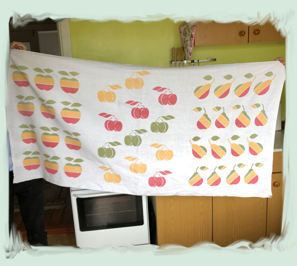
My grandmother rarely buys new things, so most of the items she has, I know by heart. After spending my first year of Master studies building a relationship to ornaments, I started to see her material Stuff in a new way.
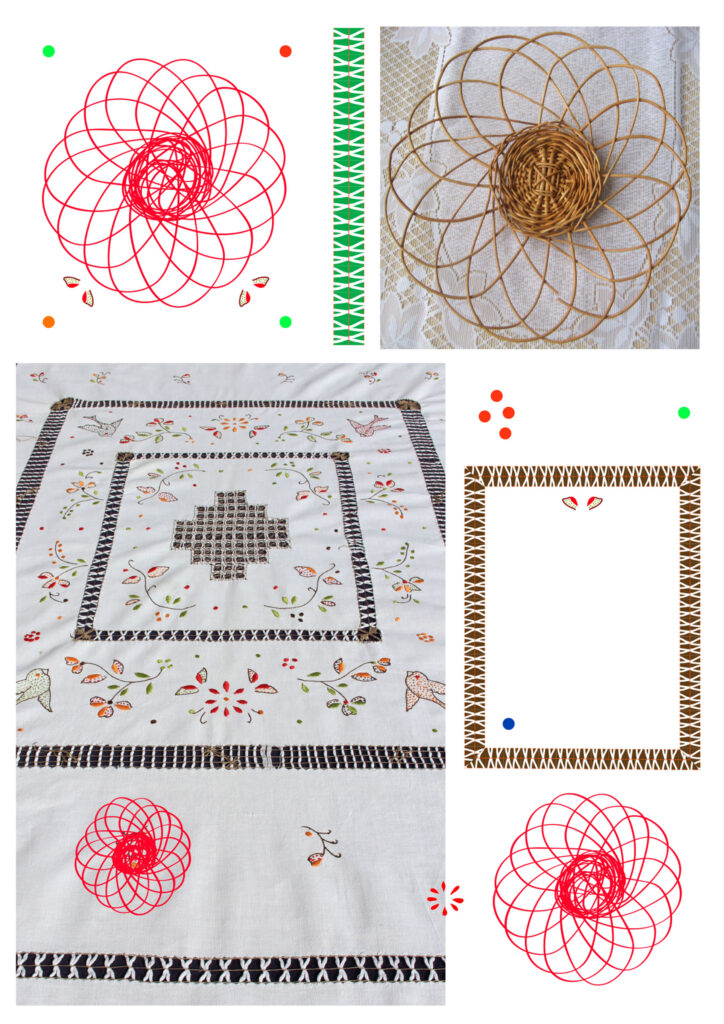
Suddenly I saw this tablecloth in her wardrobe, the same one that has been covering her laundry box for decades but I had never really looked at it.
She says she got it as a gift in the 80s, so it’s a Soviet print. The first time I heard of an Apple computer was not before the 2000s though. So could this be accidentally similar to the Apple logo, or did the Soviet pattern makers see the symbol somewhere, somehow?
Or maybe the historic truth of how the symbol has travelled, is beside the point and the intrigue lies in the cognitive clash between seeing one of the strongest symbols of global capitalism inside a Soviet era pattern.
*
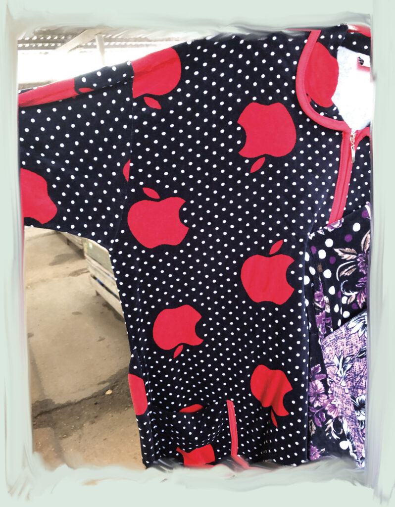
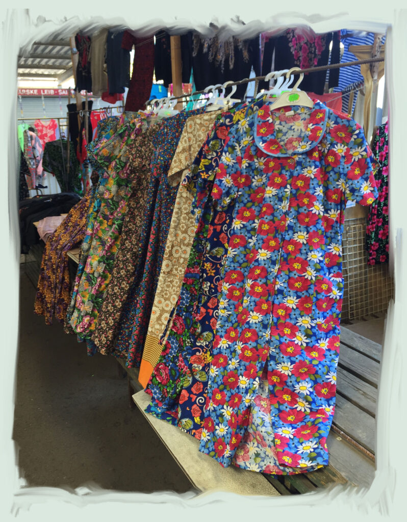
At the market I find commercial logos mixed together with nature patterns, like a dress with literal Apple logos sharing the rack with a range of other fruity and floral prints. Seeing this rack underlines how differently I might read a pattern compared to another generation, depending on a different cultural background. If recognizing an Apple feels like unlocking one door, how many symbols are in these patterns that I haven’t unlocked? What sensibility towards different kinds of patterns do these ladies have? The women wearing and selling these dresses. I want to learn their side of the Apple logos.
These Apples are something I can inject into design work to create emotional connections.
I can use a symbol that connects with only one other person in the world that I share a specific memory with. Or I can use a cookie shape that many mothers and kids in one region recognize as a childhood memory. Or I can use a Toyota logo in a flower pattern – the logo has a huge recognition span all around the world, but probably brings up many different emotional connotations, depending on the geography and socio-economics of the place. When I think of a pretty bland but pragmatic car that families go to the countryside with, I can’t assume that that is the association everyone else gets.
These Apples are a way to connect to others with a similar emotional geography. A powerful design tool, being able to connect through memories.
I have recognized that when I do make these emotional links to objects around me, the objects become more valuable to me. I am less likely to dispose of and replace these items. The emotional sustainability potential of using symbols and patterns is in a way obvious but still they have been missing from my professional design practice.


*
Back at my grandmother’s house, a special feature I have noticed is how, in her space, things are sometimes bleeding into each other. She changes her curtains and tablecloths according to the season. The weather or holidays are often manifested in her surroundings. It can easily happen that somehow, she ends up wearing a dress with a print of berries and green leaves while also decorating a cake with berries and green leaves.
Or I’m sitting there eating her cream cake when I realize – the plate, the napkins, the tablecloth, even her dress – everything is decorated with some version of a rose print. Is that her way of connecting to the roses currently blooming outside as well?
*
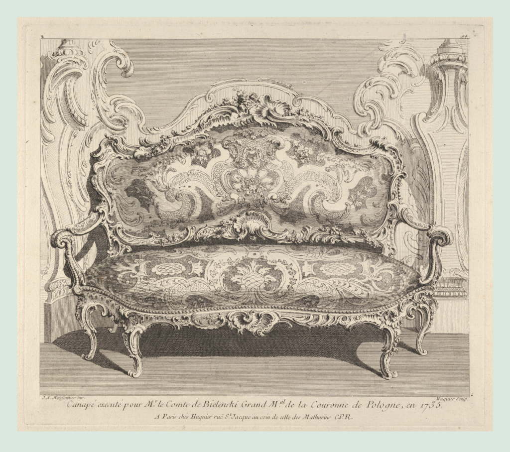
‘Oeuvre de Juste Aurele Meissonnier,’ ca. 1742–48, France
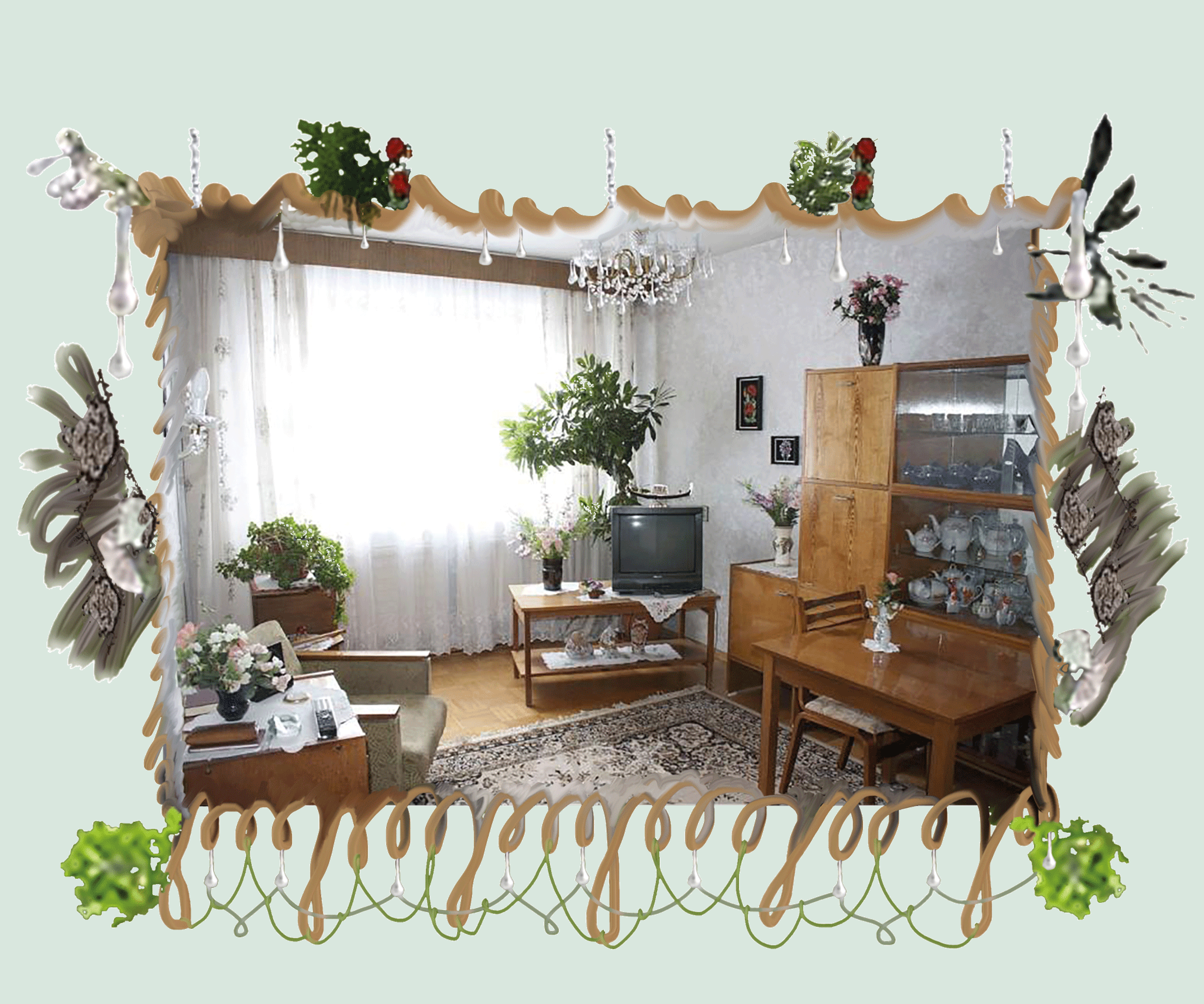
The way different objects or surfaces can bleed into each other, was a new design idea for me. I remember seeing this graphic sheet at an exhibition in Konstakademien Library in Stockholm – a design for a canape made for a palace interior in 18th century France.
It created the most basic link for me: how the textile is merging with the frame of the chair and the frame bleeds into the wall through similar, if not the same, ornaments. Blurring the boundaries between objects and materials.
How could I translate this approach to graphic design?
I thought of book layouts, and how the classic treatment of images is very hands-off. The norm is to have a clear understanding where an image starts and where it ends, mostly in a rectangular frame.
I experimented with blurring those lines, copying elements from one image into another, or making compositions on a page that plays with the inside-outside space of a photograph.
This lead me to a method of framing images that very literally copies and mixes elements from inside the photograph. One of the main functions of a frame should be to mediate the image with its back-ground, but somehow it has been largely lost when images moved into computer programs.
Creating these frames through a kind of digital crafting, I feel that the process does a few things to the image:
– It makes me look at the image longer, both as the frame-maker and I think also as a viewer.
– The viewer’s gaze is guided more strongly, as a designer I can give direction to what to look at.
– It celebrates an image and elevates it, gives it importance and gravitas.
– There is no claim of neutrality or ‘transparency’ to the photograph. It is not effortless. The staging and construction of everything inside and outside of the picture is made more obvious.
I read somewhere that for example carving a small ornament on a piece of furniture was a way of declaring a piece of design to be finished. I really get that, even a small ornament gives a sense of intent to the design, also to the parts left empty.